
 A
A
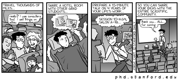
Apart from sharing a room with other students [I always book a room all to myself for sanity’s sake], the cartoon above is pretty much what it can be like when you are asked to present at an academic conference.
OK, I say ‘asked’. Only the most noteworthy, respected members of academia, as far as I know, ever get ASKED. The rest of us have to apply, submit abstracts, pay our own way there, often pay to actually attend and [as with my visit to Cologne last year] maybe discover that the actual conference bears very little relationship to the topic you are working on. Dreams of networking and making useful contacts, picking up vital information about other people’s research first hand, or even having a conversation with someone who knows the first thing about your own line of research can be totally dashed as soon as you look at the programme.
Nevertheless, presenting at conferences is part of what we are required, or at least expected, to do during our post-grad studies and, on the whole, I quite enjoy it. What I don’t like, and am constantly battling to improve, is my skills at creating a decent PowerPoint presentation. If I decide to use special effects they work all wrong. If I decide on a running order I invariably decide that I need to insert an entire section or juggle the slides round so they flow logically. Transitioning in a clever way between slides – forget it. Finally, after thinking I’ve sorted it, when I try to preview the entire slideshow I decide it stinks!
Yup, I am currently trying to create an interesting, informative PP doc. I am failing. I don’t like the images I have chosen to attract my audience’s attention. I don’t think it makes sense in the order I have put different sections. It didn’t make any more sense in the previous ways I had arranged it. And, worst of all, I don’t know if I would spend 20-30 minutes of my life watching it if I had the choice. AAARGH.


 .
. 


 “People who enjoy meetings should not be in charge of anything.” ~Thomas Sowell
 If you want to kill any idea in the world, get a committee working on it. ~Charles Kettering
 The brain is a wonderful organ; it starts working the moment you get up in the morning and does not stop until you get into the office. ~Robert Frost